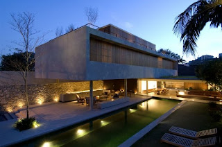
Monday, May 31, 2010

Refined Escalator Development


Hey Guys

After doing further refinements, research and development of the escalators and entry area from the HSW site I've found a form which i think i could integrate into my final theatre design. the images below show the form of my desired entry escalator area

in my design the escalators will incorporate the walls of my theatre using the same material of that diffused octagon pattern. The roof form will follow the angle of the escalators up into the theatre and try merge with the skin of the design. More updates soon hopefully Bretts to receive feedback to further this development

Mitch Out

Escalator Development


Hey Guys

After the week 13 presentation last week I've been researching and developing my entrance area and escalators up into my theatre design. After Susan's comments I've really been trying to merge my theatre with the entrance area and escalators.

I've been looking primarily at the roof form and walls and how this can correlate into the escalator form. Here's a few images of what I've found and thought i could refine and develop into a form that merges with my theatre.

Mitch Out

Thursday, May 27, 2010

Week 13 Feedback- Susan Loh, Brett Hudson

The feedback i received from my week 13 Presentation was as follows

Susan Loh- Make entry escalators work with theatre. change them from just the norm to be something more beautiful that relates to my theatre design.

Brett Hudson- To be confirmed

from this feedback i found it both informative yet also hard to fully correlate into my design. Susan may not fully understand the reasons and concepts behind the way i have laid and set my theatre design out. Therefore i believe it is important to follow up on Brett's feedback in conjunction with Susan's as Brett has worked and watched over my concept the entire semester and understand my theme and choices in more detail.

For Now
Mitch out


Site Plan


Here is a site plan of my proposed theatre


Wednesday, May 26, 2010

Render Axonometrics


Hey

here is a series of site axonometric renders i have produced to explain my theatre in its site context. These explain the form of the design and how it correlates with the howard smith area and story bridge.

Journey 4

Heres the final journey. This is from the new farm residential area heading towards the Brisbane river showing my theatre layout and placement under the story bridge

Journey 3

Heres the third journey from new farm and the river city walk


Render movies Journey 2

heres the second journey to the site this time its coming from the brisbane cbd and valley area


Render movies Journey 1

Here are a few render walk throughs of the journey to my theatre from the surrounding site and its context


musion video links

heres some cool links of the musion eyeliner in action


samsung - really good video of the technology at its best
http://www.musion.co.uk/Samsung_Jet_Launch.html

speedo
http://www.musion.co.uk/Speedo.html

gorillaz
http://www.musion.co.uk/Gorillaz_MTV_Awards.html

Reebok
http://www.musion.co.uk/lewis-hamilton-hologram-revealed-by.html

adidas david beckham
http://www.musion.co.uk/David_Beckham_Adidas_London_2012_Press_Launch.html

there are so many more but these give you a very good idea of how it works, looks and sounds

Musion Eyeliner Past Presentations

Hey guys

been doing my research further again on musion eyeliner projection technology and thought id list a range of the companies, celebrities, bands etc which have all ready used this technology for some form of event they include:

-David beckam Adidas
-auto trader
-Bacardi
-British American tobacco
-British fashion awards
-bt conference
-cadbury
-caterpillar machinery
-fiat
-fifa pro
-ford
-gm motors
-gorillaz mtv awards
-land rover
-live earth al gore
-Madonna and gorillaz
-nokia
-England Olympics bid
-prince Charles
-Reebok Lewis Hamilton
-samsung
-sir Alex Ferguson
-speedo
-sunsilk
-target
-telstra
-rove mcmanus
-Toyota
-virgin
-Wimbledon museum

as you can see the list is quite famous and well known. i think this technology in my theatre will further enhance is status within the city and country making it a highly innovative and popular venue to visit

Mitch out

Monday, May 24, 2010

SKETCH RENDERS


EY TEAM

HERES A FEW QUICK SKETCH RENDERS WITH A FEW HIGHLIGHTED ELEMENTS

MITCH OUT

DEVELOPMENT Renders


AS MY THEATRE DEVELOPMENT CONTINUES HERE ARE A FEW CREATIVE RENDERS IVE CREATED. I FIND THAT THESE SECTION PERSPECTIVE REALLY EXPLAIN AND EXEMPLIFY THE SPACES AND INTERNAL FORM OF MY DESIGN. MORE TO COME

MITCH OUT.

Wednesday, May 19, 2010

Development Renders


Hey Guys

Heres a couple of renders i made to show the development of my theatre as i prepare for my final presentation

Tuesday, May 18, 2010

Theatre Space layouts


Hey Guys

As Ive been developing my final design. I'm at a stage where I'm looking at making my theatre spaces more welcoming and experiential. Ive found a few images with show the use of sunken lounges combined with lights which could create the desired casual theme I'm after. This layout can accommodate a range of activities and make the environment feel comfortable to inhabit.

it evident with the use of lights spaces can create vastly different moods and experiences

Mitch Out
Monday, May 17, 2010

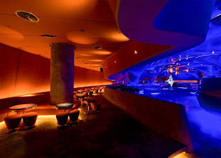
Bar Space Design


My Interior Bar Spaces i want to look highly similar in appearance of this image. These small elements and form can hugely enhance the overall experience when within the theatre.

interior Space Development 2


Further images explaining interior spaces. And a single image showing a floating building form similar to the form of my theatre however more geometrical.

Interior Space Development 1


Hey guys

after doing further research of interior installations and artworks i have collected a series of images to help identify this theme i am pursuing. Each of these images represent the different spaces within my theatre and the flexibility in moods and emotions it could create.


Interior Space Development

Hey Guys

As my theatre planning is continuing on. Im at the stage where i am starting to analyse the interior spaces and the feelings and emotions they will provide to the viewers. Within my theatre there will be a series of spaces each with unique interactions and technologies.

The core theme im going to run with for the interior spaces is

"A TOUCH OF COLOUR"

the cool hunter website has great examples of this currently. check this link http://www.thecoolhunter.com.au/design

Mitch Out

Skin Experimentation 2


Hey Guys

Heres is a more refined render of my skin and its relationship to the interior spaces and elements of my theatre design.

Mitch Out